The Future of Intent-Driven Design
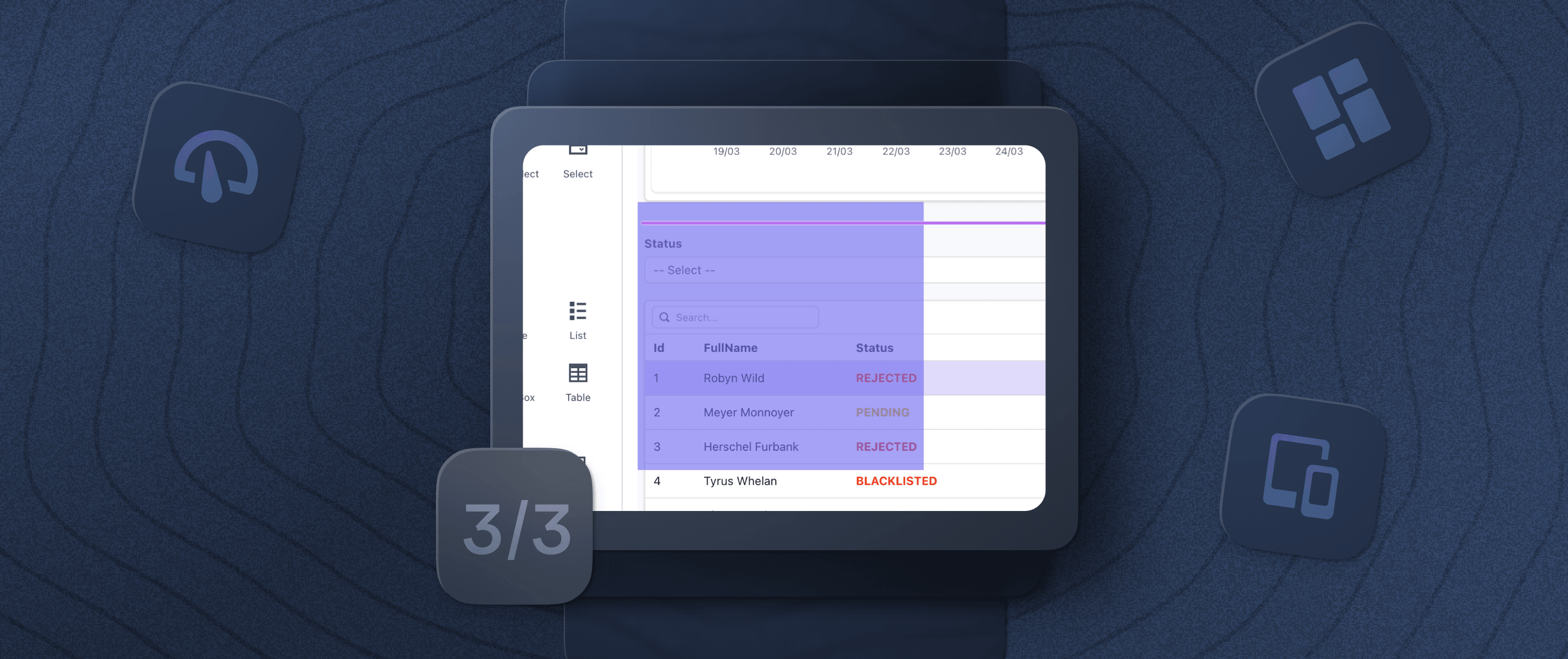
After deciding that intent-driven auto layout with a drag-and-drop interface was the future of Appsmith’s UI-building interface, we made a significant investment of time and energy to overhaul our codebase to support this new, innovative functionality.
While this investment was worth it for the user-experience benefits provided by intent-driven layout alone, this work forms the foundations for something much grander. We are extending the concept of intent-driven design to cover many more aspects of UI-building, from app-level layouts to theming and beyond. In this article, I look ahead to where we’re taking intent-driven design and our goal to completely redefine the front-end experience in the internal tools space.
Building on the next big thing: app-level layouts
With intent-driven auto layout, Appsmith is now able to assess where you want to put a UI widget on the canvas and place it there — without unnecessary per-pixel adjustment and with sensible reflow across different screen sizes. This allows developers to move quickly when building their UIs without worrying about maintaining complex user interfaces as their applications grow.
This process, however, still requires that you choose the right input type for your data fields and manually drag the corresponding UI widgets, one by one, onto the UI canvas. You have to repeat this over multiple pages for every entity represented in your application. This is still an arduous process and largely unnecessary for many use cases.
The layout and inputs for a given table, and the interface that follows, are largely predictable, so we’re expanding our intent-driven UI system to cover app-level layouts. This system will allow you to select a layout template and automatically populate it with all of the required UI widgets — generating the entire layout for your application, which you then only need to tweak. This is the next step in the automation of UI-building interfaces.
To ensure that we’re enabling our users and improving their app development workflows, we’re conducting ongoing research on a large sample of apps already built on Appsmith, as well as learning about the kinds of apps that developers want to build on the platform in the future. We can then maintain a set of universal layouts that serve as a skeleton for most, if not all, types of applications.
What makes a great app-level layout
Let's look at what makes an effective app layout, starting with an example that we’re all probably familiar with. Gmail is a good example of how the typical email application layout should look and behave on desktop and mobile.
On the desktop version, the navigation menus are on the left side and the list of messages and the message content are on the right. It automatically reflows to one column on mobile with the menus at the bottom. UI elements collapse, and less important UI elements are organized inside menus.
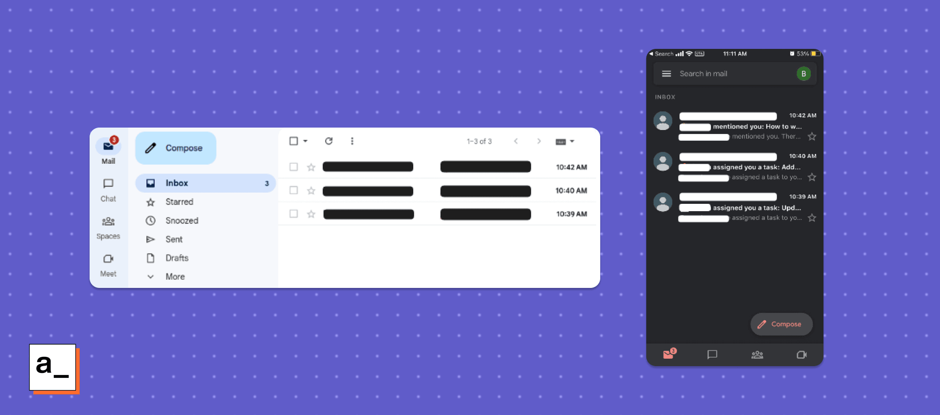
Most email applications like Gmail have the same general layout on desktop: a set of menus on the left and the sequence of messages and content on the right. On mobile, this layout is reflowed to one column containing messages, with the menus on the bottom.
Now let’s look at a different type of layout, using the simple database GUI in Appsmith’s quickstart documentation as an example. For an app like this, you would want a table widget that shows you the exact rows and columns in your back-end database. And you’d probably also want another widget that displays the information for an individual entry that you select and allows you to read and update it.
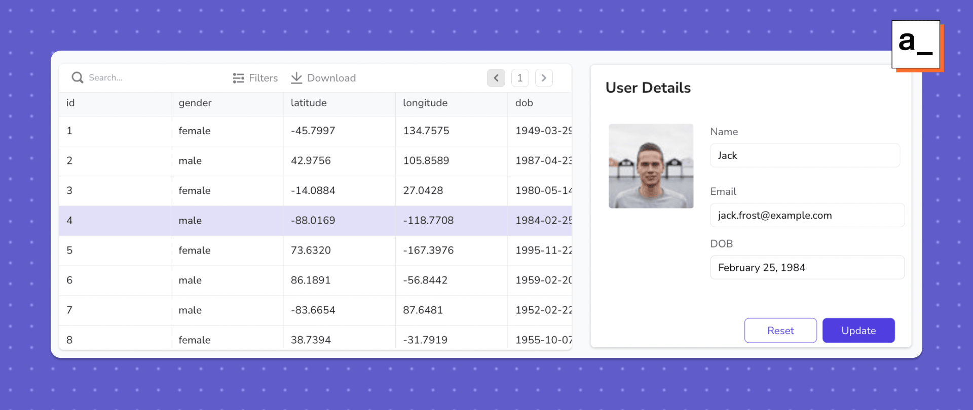
This general structure would be involved in all database GUIs, so this is worth storing as a template in the set of app-level layouts.
You could imagine similar patterns for other types of applications. Company wikis would need a search bar and an expandable structure of categories, as well as room to load individual articles. And internal social apps might need a menu bar, a place for messages to be displayed in your feed, and basic information about your connections.
By identifying common patterns in applications, building on the examples set by other high-quality applications, and following user intent, Appsmith can automatically create a template with all the widgets that a certain type of application would need already in the right positions. Our users can then efficiently make adjustments and add new widgets to the layout with the existing auto-layout functionality.
Automating beyond positioning: intent-driven theming
The key lesson that I’ve learned with intent-driven auto layout is that it isn’t about adding more knobs to your UI-building interface, but rather making the platform smart enough to do what users want without them having to think about or tinker with knobs at all. Developers usually don’t need or want to control all the widget positioning and sizing decisions in their UI; they just want a good-looking UI.
Before intent-driven auto layout, Appsmith developers had to worry about a long list of attributes for each widget, like its position, dimensions, alignment with other widgets, etc. They would also have to constantly assess the impact of making changes, including factors like:
Are these widgets aligned correctly?
Is this widget the right size?
Is this button centered correctly?
Does this change break the layout on other screen sizes?
Intent-driven auto layout solves this problem, but Appsmith developers still need to worry about similar factors when making stylistic choices. They have to think about things like font family, text size, text color, text emphasis, background colors, border colors, border width, etc. And there are additional questions to consider when defining the style of an application, such as:
What is the tint of the action color?
Why is the border not visible?
Is the text readable?
Again, developers don’t want to control all the tasks needed to make good stylistic choices in their UI; they just want a good-looking UI. So in the same way that we automated the positioning and reflow of widgets on the canvas with auto layouts, we plan to automate stylistic choices in the UI with auto theming.
How would intent-driven theming work?
The idea is simple. We plan to optimize for speed of creation, just like with auto-layouts. The goal is to instantly achieve through automation what would normally take many hours of manual tweaking from a professional designer. We can do this by creating a set of algorithms which replicate the manual work of a capable designer provided with a “seed” color scheme (from a brand, for example).
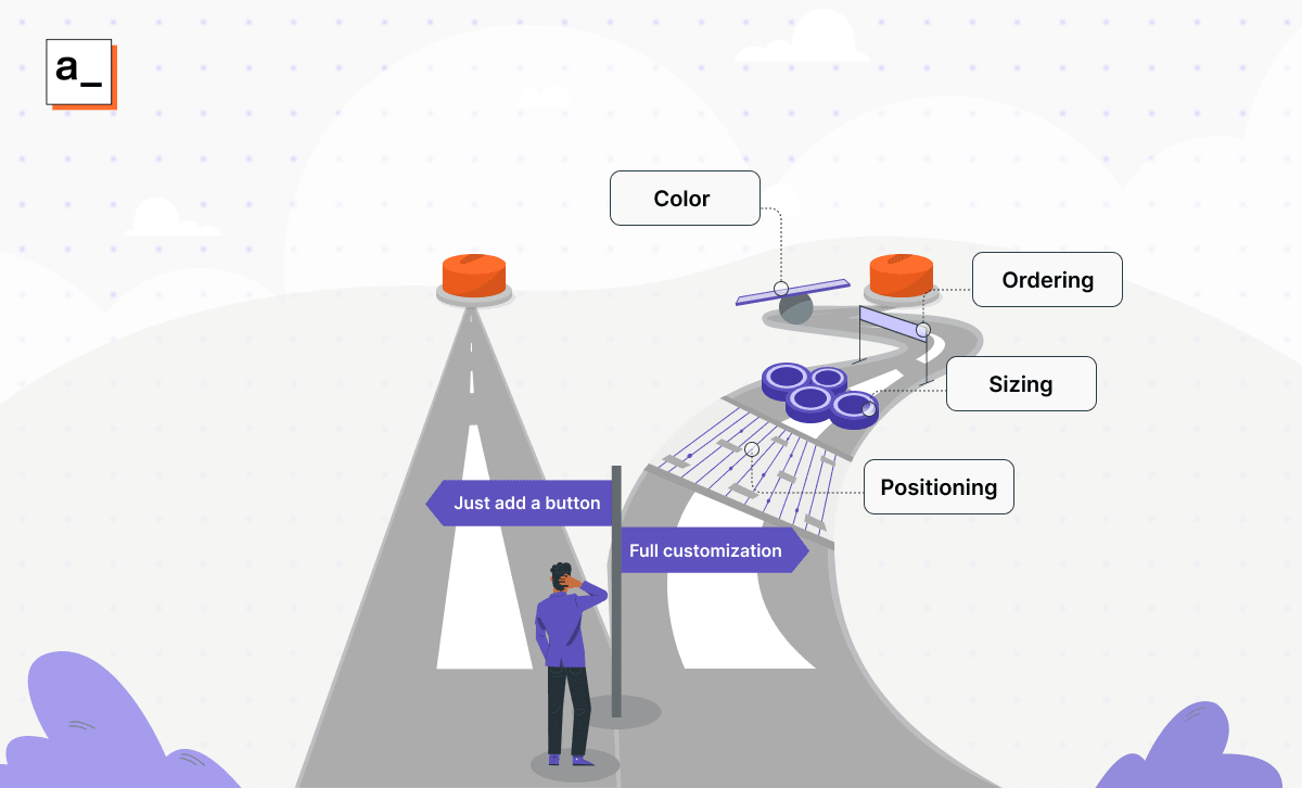
Ultimately, the user wants a big red button that looks good on their interface. The added knobs to adjust positioning, ordering, sizing, color, etc. often do not help, but are instead obstacles to that goal.
However, the technical solution to achieve this is complex. The algorithms will need to take a default color scheme and computationally generate many different complementary colors. It will also need to intelligently consider things like luminance, chroma, hue, and contrast for colors. And let’s not forget about making good choices with respect to color selection for borders, shadows, fills, text, etc. within widgets. All of this must both look good and not detract from the accessibility of the user interface.
The implementation of this functionality is very complex and still in the research phase at the moment. But if you want to get an idea of how something like this could be done, have a look at these resources for automatically computing contrast and automatically generating complementary colors by “rotating by 180 degrees on the color wheel.”
The goal of intent-driven theming
The majority of UX designs implemented today build on existing work. All design choices, even the most seemingly complex and creative, are the result of applying tried and tested patterns in different combinations. Right now, these patterns are scattered in design manuals, algorithms, and professional designers’ heads.
We’re not trying to compete with the best designers in the world for the most innovative application layouts, as that would be very difficult, if not impossible. Our goal with intent-driven design in Appsmith is to consolidate these proven design patterns into one algorithm so that our users don’t have to spend years studying front-end design to build highly functional, attractive, and responsive applications.
Internal app tools used to be boring — we’re putting them at the cutting edge of features for developers
Once we had decided that we were all-in on intent-driven design, a whole new world of possibilities opened up for the Appsmith platform. Instead of throwing more and more complexity and customization at our users, we realized that the solution should be the exact opposite: reduce complexity as much as possible and make our UI-building interface smart enough to implement the “right” design choices automatically.
We’re interested to hear what you think about our work in intent-driven design and our future plans for the Appsmith platform — both as developers and as end users. We also hope that our discussion about some of the steps and missteps taken during our development process is useful to other development teams.
If you have any comments, suggestions, or your own developer story to share, be sure to join our community or see these new features in action by signing up for the cloud-hosted version of Appsmith.
