Building Responsive UI Tools: Everyone Keeps Making the Same Mistakes
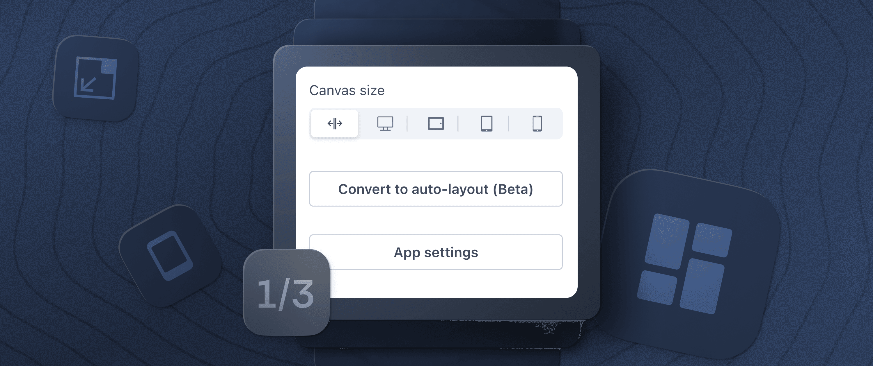
Design decisions have direct effects on how users interact with your application. We’ve found that this was especially true when creating Appsmith’s canvas, which is used to build the user interfaces (UIs) for applications.
UI requirements can define many aspects of an application, from its architecture to its dependencies, so these decisions are especially important at the earliest phases of development.
In this three-part series, I discuss the design decisions behind our “intent-driven auto layout” functionality, how it fits into our vision of what a truly great UI looks like, and where we are taking it in the future.
To start, let’s look at what we at Appsmith (and most others) have been doing wrong when designing UI-building interfaces for our users.
The critical mistake that app platforms make — giving the user too much freedom
When building UIs for internal tools platforms, most platform development teams make one critical mistake: they believe that (like themselves) users want to tinker with their UIs, so they provide a multitude of knobs to control exactly how the UI looks, often down to positioning elements at the pixel level.
What users actually want is a fast way to build attractive, functional and intuitive user interfaces for their apps. Including as much granular control as possible over UI elements adds layers of complexity, which drastically slows down the creation of the UI and often makes the final product difficult to use.
We’ve seen similar patterns show up in text editors as well. Earlier tools like Microsoft Word provided a lot of features to be “creative,” whereas newer tools like Notion have very few text options, rich formatting tools, etc. But this is actually good because it allows writers to focus on the text instead.
 Allowing too much freedom when building can result in products that are non-functional or very difficult to use for non-professionals or non-experts. Adding intelligent guardrails can solve a lot of problems.
Even if users explicitly ask for more customization and control, we’ve found that it’s better to understand what they want to achieve with their design and better accommodate these requirements in our design tools. This is generally a much safer, more scalable option than adding more bells and whistles. Sometimes good design isn’t about giving the user what they say they want, but uncovering their true need, which often takes a lot more consultation, planning, and work up front.
Appsmith was guilty of this too — how can freedom not be a good thing?
Despite this, we at Appsmith did initially adopt the view of giving users more knobs and more complexity so that they could control every aspect of their UI. And, because of this, we allowed users to do things with their UIs that were ultimately harmful to their application.
For example, early versions of Appsmith didn’t enforce any sizing constraints on widgets. Users could squash labels and buttons to make them completely unusable or expand them to the size of the entire canvas. These are things that should never be done if the goal is to create a functional UI.
Initially, we didn’t think this was a problem that needed solving. Our thought process was that developers would never intentionally build a bad UI, so there was no reason for us to spend time adding guardrails. While this was true for some, the reality is that not all developers are interested in UI design.
Our users also had to constantly make small design decisions that, when added up, detracted from the usability of their applications. These weren’t a problem… until they were. Once their apps reached a certain level of complexity, or they suddenly had to be supported on a different screen size, our users would have to spend a lot of time fixing things.
We tried to optimize for a low barrier to entry when creating UIs rather than scalability and maintenance down the line. We tried to implement fewer rules so that users could do anything, rather than adding more rules to encourage good design patterns. And as issues started to pile up, we realized this was a mistake.
Like other major players in the internal-apps space, we thought just giving users the ability to define different layouts for desktop and mobile devices would be enough to solve this problem. But the problem here was that users had to spend a massive amount of time managing two separate UIs for one application. And this wasn’t a good use of their time.
As we gained experience and learned from the developers using Appsmith to create the UIs for their applications, we started to realize the drawbacks to these early design decisions. We saw that “possibilities are endless” often means shifting responsibility to end users who have to “figure it out.” But the truth is that users are often too busy to worry about smaller decisions like this.
Too much freedom when building UIs in our app studio was negatively impacting the quality of the applications being developed by our users, causing frustration and wasting their time. It was causing UIs that were ugly by default, when it should have been doing the opposite.
Users need a streamlined UI-building experience
Internal app developers need to be able to produce reliable, functional, and easy-to-use applications, such as CRUD interfaces and data dashboards, quickly. Users adopt an internal tools platform because they want to reduce busy work — if they wanted to customize everything in their app, they would use an IDE and build their app from scratch or use a library like React. Once we realized the significance of this, we started to see more customization for the UI as a liability.
It is also clear that Appsmith users expect a generic app to be mobile-friendly by default. Historically with app-building tools, users have had to babysit two (or more) different layouts for the same app. Doing something as innocuous as adding a button often created a bunch of problems on the mobile version as the entire layout sometimes had to be reconfigured to make space for another widget.
It was clear that our initial design wasn’t able to support the experience that developers expected. It relied on absolute positioning, meaning that users had to drag widgets onto the screen and make manual adjustments to get things to look the way they wanted. While this UI-building interface was intuitive and easy to use, building complex UIs with it was laborious and error-prone.
As we explored the existing solutions in the internal tools space, we found that many others solved this problem by exposing the complexity of CSS flexboxes to their end users. When building their apps, users would then have to consider the devices they wanted to target, the positioning properties of the UI elements — including horizontal and vertical stack, horizontal alignment, sizing, etc. — and then configure and preview them.
We didn’t want to take this road for Appsmith, and decided that we would find a better solution for our users. We would allow them to use a drag-and-drop interface to quickly build and preview their own user interfaces that would automatically work on any screen size.
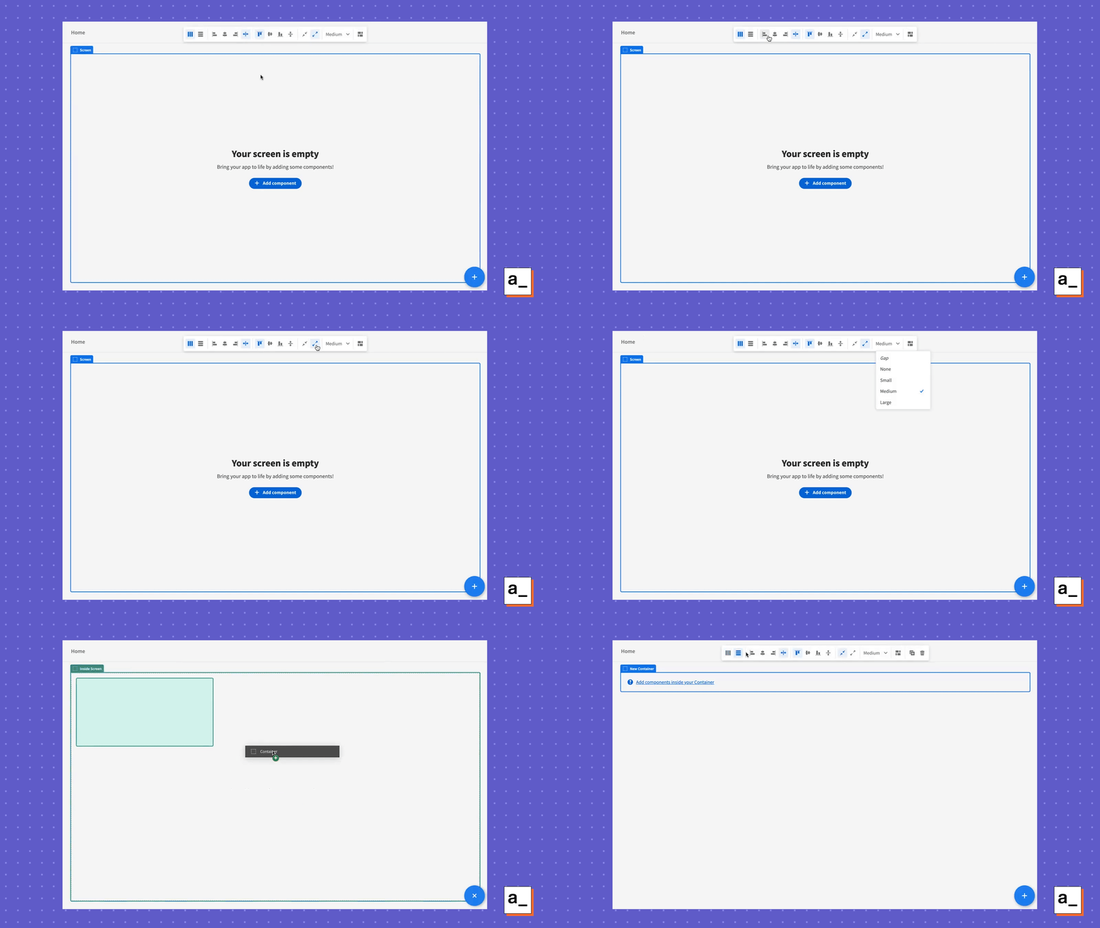 Users have to consider many properties when adding basic widgets and constantly adjust them without the benefit of intuitive dragging and dropping.
How we at Appsmith decided to solve this problem
Previously, our tool encouraged poor UI design because that was much easier to do than good design. The reason was that every new knob we added was one more thing that could go wrong and one more thing that developers had to worry about.
After many months of research, consultation with our users, and leveraging our experience in the field, we had drafted and validated a viable plan to implement a smart drag-and-drop interface: one that could place UI elements and widgets where the user wants them to appear, rather than at a specific pixel coordinate.
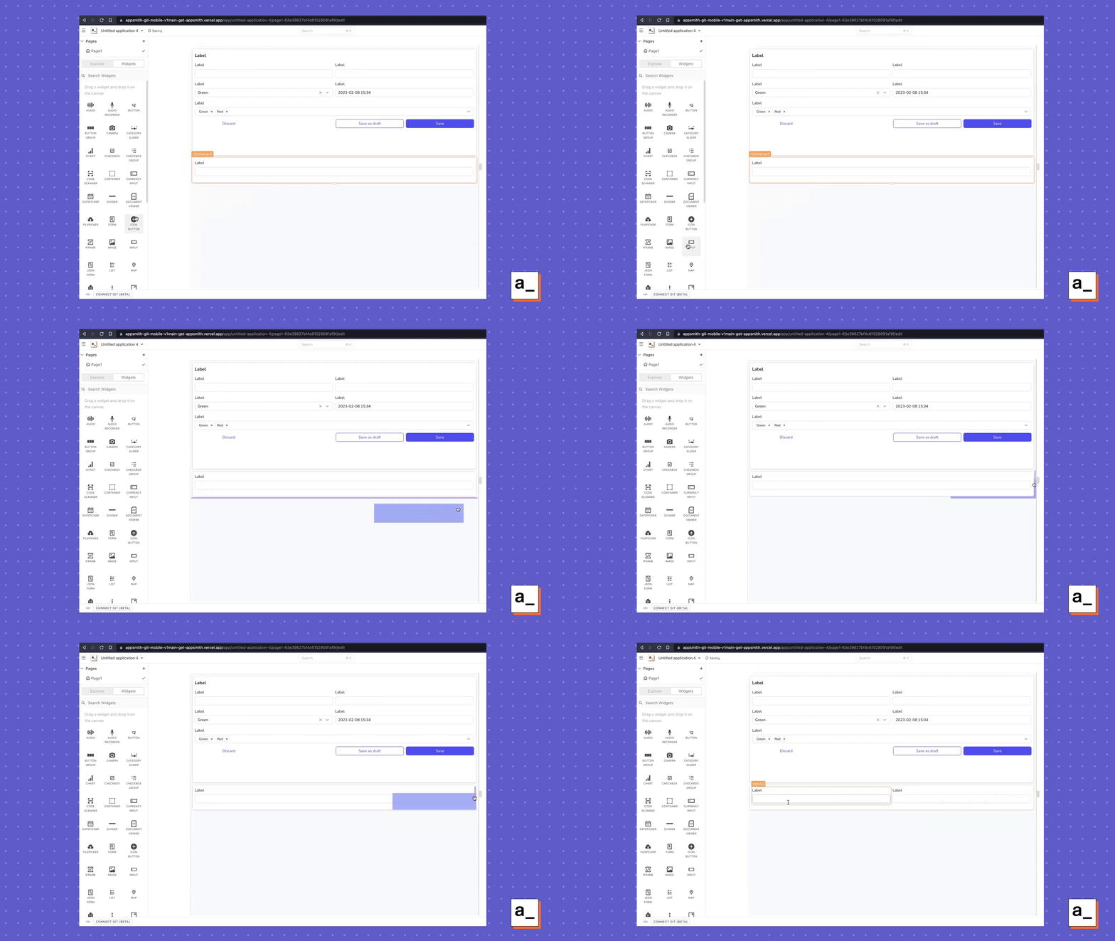 We wanted to adopt the auto-layout functionality already in the space, but combine it with an intuitive drag-and-drop interface that users were accustomed to. That way, they didn’t need to think about the complexity of CSS flexboxes when designing their UI.
We’ve labeled this approach intent-driven design. Instead of giving users more knobs to customize every little intricacy of their UI, we decided to take the knobs away entirely. We wanted users to specify what they wanted through an intuitive drag-and-drop interface and use algorithms and heuristics behind the scenes to offload the routine work of positioning everything appropriately on the canvas.
Internal app developers are generally most concerned with their back-end queries and logic – they want their application to interface smoothly with their data by allowing for fast data retrieval and accurate data entry. The benefit of Appsmith for them has always been that complex tech stacks can be quickly spun up without even having to think about the massive complexity at each layer. So now we’re just extending this principle to UI design.
Why should users be forced to learn UI design to build a good app?
User interface design is a field of its own. Professional designers study for years to be able to build user interfaces that are visually appealing and accessible to broad audiences. We don’t think that internal app developers should need to have this experience to build their own great user interfaces — so we’re using our own to automate the process.
We’re already seeing results from our continued work on our UI-building interface: Appsmith users don’t have to spend hours pushing pixels around and babysitting multiple layouts. They are able to create apps quickly with good-looking UIs that just work — even across different screen sizes.
UI responsiveness has been an interesting problem to tackle, and one that we hope will set the standard for the entire internal tools space. I’ve only touched on the work that went into this, so read on to see how we pivoted our UI-building functionality and how you can avoid our mistakes by prioritizing your design choices up front.
