Advice for Backend Developers Building Internal Tools


Appsmith’s CTO, Arpit, once mentioned in an interview that boring is good. Appsmith is an open source framework that can be used to build internal custom software. Our engineers believe that code should be well-maintained. The steps required to do that (from focusing on code comments to prioritizing readability), however, can be rather dull. But if that what it takes to create well-maintained code, then boring is good.
This is a fitting opinion from someone building a startup that supports engineers creating tools to be used internally by the company. These tools and the process to build them are, of course, notoriously tedious. They are still important, though, and so it would make sense to come to the conclusion again that boring is good. But why exactly are internal tools boring...and what if, unlike code maintenance, they didn't have to be?
Why internal tools tend to be boring
Creating an engineering tool at least has a few bright points. You can access them via CLIs and get some street cred because other engineers use it. But there’s another class of internal tools - the ones which engineers build for functional users (i.e non-engineers). You know, those workflow UIs or admin panels for support agents, sales folks, marketing and (gulp) HR. Yes, those. Comatose.
Regardless of how tedious and monotonous these tools are, someone has to build them and there’s a good chance the task will fall to you or a fellow backend engineer. But keep in mind that the reason internal tools are so dull is because they are so terrible to look at and use. Poorly thought-out tools can slow the user down, require them to take unnecessary steps to achieve what they're trying to do, and overall leave them displeased. So what’s the solution here? Despite your status as a backend developer who likely has little to no training in design, the look and feel of the tools you’re building need to be top-of-mind.
Here are some things to keep in mind when thinking about building your own non-boring, highly usable internal tools.
Deciding when to build an internal tool
There isn’t really a widely accepted, standardized time to build an internal tool. It often starts as a tiny itch (read: pain point), which goes away when you scratch it. But then it keeps coming back until you decide you can’t take it anymore and need a bigger, better, more permanent solution.
But this ad hoc method is inefficient and slow. It makes more sense to have a pre-set list of criteria that a pain point should meet in order to trigger the team into building an internal tool to solve it. One way to approach this is in terms of how much developer time goes into solving an issue that comes up repeatedly.
Slack engineers Greg Pelly and Mark Christian share a good rule of thumb: “Consider building tooling around tasks that require a developer to open a browser window.”
In their post on building internal tools, they share how Slack engineering used this rule to build a variety of CLI tools for their engineering teams to solve problems like syncing files between developer machines and remote servers every time a file is saved, or tools for generating fake data on development servers or fixtures for writing unit tests.
They then created the slack-cli project (now open sourced as magic cli), which is similar to git command line tools, to streamline their workflow by packaging together their individual shell scripts. This shared set of tools helped new engineers focus on their projects, enabled everyone to stay focused on their tasks, reduced the amount of unnecessary information developers had to remember, and allowed improvements made by one person to benefit everyone.
A similar approach works for tools built for functional teams too, and there’s two metrics that you should consider:
The time that devs spend serving the operational needs of functional teams
How many browser windows/clicks/toggles functional teams are currently undergoing to perform their tasks
If you’re a developer, you will notice the first metric immediately even if you might not immediately be able to quantify it. The second metric often comes out in strange ways leading up to that functional leader bringing it up.
UI/UX considerations while building internal tools
Mapping labels and input widgets
You definitely want to be careful with the mapping of label widgets and their corresponding input, textarea, and select widgets. Without this, clicking on the label text won't focus the corresponding input. This is a seriously annoying UX problem, and makes your app look and feel very unprofessional.
This is hard because for the mapping to work, the for attribute on label must be set to the same value as the id of an input. Moreover, that id has to be unique throughout the HTML page. So we need to be careful to get this right, especially on pages with a lot of inputs/forms.
It's possible to avoid that problem by wrapping the input widget inside the label element, but this makes them extremely inflexible to style, and is usually just not worth it.
For buttons that run an HTTP request on click, remember to disable them while that request is running
Without this, a user can easily accidentally click on a button twice and call that HTTP request twice. This can have side-effects ranging from annoying embarrassments to just plain danger. For example, if the button is "Submit Comment" on a ticketing app, then the comment might be posted twice. Or if the button is about extending a trial customer's trial period, their trial may get extended twice, causing the company to lose revenue.
More often than not, we tend to just miss this case. And even when we do handle it, we have to take care to re-enable that button, if the request finishes successfully, if the request fails with an error, or neither happens and the request just stalls for 10-20 seconds, only to timeout.
In all these cases, the button has to be enabled again, or the user will be blocked.
Tables cannot scroll horizontally, unless wrapped in an element specifically styled to support horizontal scrolling
Tables, especially ones displaying dynamic data, are prone to becoming wider than expected. During development and testing, we tend to use simple/small values for the table cells. But if there are longer texts in there, the table can become really wide. If not styled to scroll horizontally, the entire page will end up scrolling horizontally, not just the table, creating a weird and amateur-looking UI.
Honestly, I wish there was a way for tables to overcome this glitch automatically. This is not really hard to solve, just yet another potential issue to keep in mind when developing such UIs.
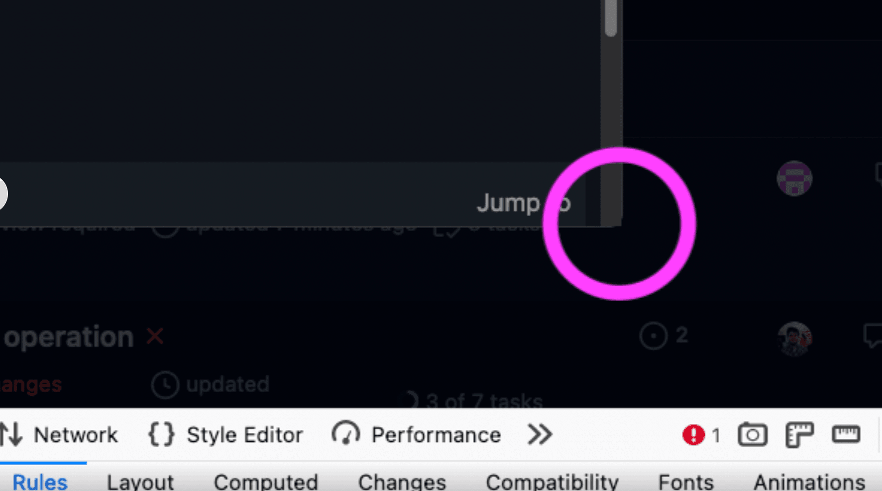
Boxes with rounded corners may leak the background of contents
This is extremely easy to miss, and although hard-to-notice, can easily give off an impression of amateurish UI, when not handled properly.
Forget internal tools, even GitHub has places that suffer from this. See the screenshot below for an example.

Authentication and Authorization

A big part of building internal tools is thinking about the right authn and authz.
In addition to core security, you also now have to think about auditing, compliance, data management, access control, etc.
In this session from Snyk, Or Weis (Founder of Permit.io) and Brian Clark (of Snyk) cover some valuable lessons around authentication and authorization. While the talk isn’t specifically focused on internal tools, the general principles apply:
Decouple code from policy: They suggest using policy as code (PaC) and managing it separately, ideally as a separate microservice that the other components in the application can query. They also mention that while the microservice doesn't have to be perfect, it should be something that can evolve separately and be refactored easily with new requirements.
Design for event driven updates (decouple data from code): Sometimes the access will be determined based on information which isn’t residing in any particular database. For example, only show customers that have paid > $30000 to Barry, the support agent. This data is probably coming from a system like Stripe. And so you’d want to connect these external layers to your authorization layer (through webhooks etc).
Implement GitOps: Ideally you want to be managing these complex rules and instructions that are ever changing, with many stakeholders, through code. By managing your policy as a separate code (ideally in a framework that is suitable for it) in a Git repository, you can elegantly manage versions, tests, benchmarks, and code reviews. This prevents you from reinventing the wheel on how to manage the policies and how to connect this to your system.
Incorporating design principles for internal tools when you don’t have designers
Chances are, your internal tools team doesn’t have a designer or someone thinking about UX. In fact, most likely, you don’t even have a frontend engineer. All you have is a backend engineer trying to unravel DjangoAdmin or trying to keep up with React’s documentation.
As a result, often, the tool looks like something that the average user would be too scared to click, lest they end up with a virus or something.
In case you do have a frontend engineer in the organization who functions as a bit of a “rookie designer” (or so they think), consider that they can play a dual role like how Claudia Conceicao, an engineer, did as a part of Farfetch’s Experiments Team. Doing it this way allowed them to be able to effectively anticipate tradeoffs between design ideas and implementation feasibility.
And definitely spend ample time with your tool’s supposed “power users” (read: guinea pigs) and use them extensively for regular testing, feedback, and early rollouts as "beta users".
Why? Just like any other project to ensure that you don’t have to run into bugs or quarrels later. (Avery Pennarun’s indecisiveness post is cool reading here). Remember internal tools unlike other tools are thrust onto the users and often they can’t use alternatives.
Internal tools might evolve into internal platforms
While a lot of internal tools can be point solutions, often, if the impact is large enough, they can evolve into platforms.
Zoe Sobins, a Senior Engineering Manager in the Platform Engineering team at Hubspot talks about this and broader learnings around platform engineering while building internal tools at Hubspot in this incredible podcast (transcribed as a blog post).
The project originally aimed to create a central location for core reports, but it eventually evolved into a platform engineering project due to the need to support multiple report types and teams. The team first built a core reporting platform and then developed customer-facing applications on top of it. They then approached other teams with point solutions for reporting to get them supported by the platform infrastructure.
In platform engineering, it is necessary to compromise on some functions and create a central solution that works for the majority of use cases. She was happy with 80-90% coverage. She highlights that building a tool that works for everyone is challenging because it may not meet the specific needs of each team.
Conclusion
Remember, being a backend engineer doesn’t make the quality of UI design any less important for your internal tools! Hopefully this post will give you a solid start on what to do and what to avoid on your way there.
Customary plug
At Appsmith, we’ve built an open source product to help developers not rack their heads while building internal tools. Use pre-built UI components, integrate with databases, REST API/GraphQL, write JS anywhere, and manage access control easily. Check it out here.
Cover artwork by Jemma Josestagram.com/thatgorillagirl?igshid=YmMyMTA2M2Y=


